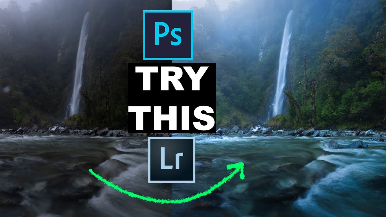
There is a specific kind of disappointment that only photographers know. You were standing in a forest at first light, mist threading between the trees, a waterfall catching cold blue sky in its current. You felt it. You pressed the shutter. Then you open the RAW file and it looks like a gray sock. Twenty years of doing this professionally and I still have to talk myself down from that moment. The file is not the photograph yet. It is raw material. The craft is in knowing how to pull out what you actually witnessed.
I have my own processing habits built up over decades of trial, error, and a lot of wasted time chasing the wrong sliders. So when I came across William Patino’s tutorial on editing landscape RAWs, I watched it start to finish because the sequence he walks through is clean, logical, and avoids the overcooked look that plagues so much landscape work today. Watch the full tutorial on YouTube before or after reading this, but what follows is a step-by-step breakdown you can put to work immediately in Adobe Camera Raw or Lightroom.
Step 1: Crop and Clean Before Anything Else
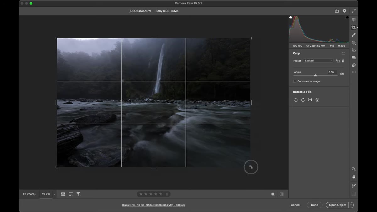 Cropping the foreground in Adobe Camera Raw
Before touching a single color or tone slider, crop the image and remove any obvious distractions. Patino deals with a raindrop on his lens right away, and that discipline matters more than it sounds. Post-processing has a compounding effect. Every adjustment you make afterward will interact with whatever is in the frame. If a distracting element is present when you start pulling Vibrance or working curves, you will either draw attention to it or waste effort working around it later. Crop first, clone or heal what needs to go, then treat the frame as final and start editing.
Cropping the foreground in Adobe Camera Raw
Before touching a single color or tone slider, crop the image and remove any obvious distractions. Patino deals with a raindrop on his lens right away, and that discipline matters more than it sounds. Post-processing has a compounding effect. Every adjustment you make afterward will interact with whatever is in the frame. If a distracting element is present when you start pulling Vibrance or working curves, you will either draw attention to it or waste effort working around it later. Crop first, clone or heal what needs to go, then treat the frame as final and start editing.
Step 2: Set Your Color Profile to Landscape
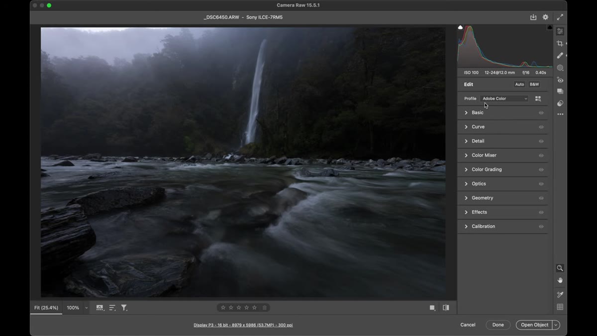 Color profile dropdown showing Landscape option selected
In the Camera Raw panel, before touching exposure or white balance, go to the Camera Calibration tab (in ACR) or the Profile section at the top of the Basic panel (in Lightroom) and switch the profile to Landscape. This single move gives the colors an immediate and honest boost. Greens become more saturated, blues shift into a richer register, and the darker tones open up slightly. The reason Patino flags this as the very first color step is important. If you dial in all your other adjustments first and then switch profiles, the cumulative effect can push colors well past believable. Start with the profile, then build from there.
Color profile dropdown showing Landscape option selected
In the Camera Raw panel, before touching exposure or white balance, go to the Camera Calibration tab (in ACR) or the Profile section at the top of the Basic panel (in Lightroom) and switch the profile to Landscape. This single move gives the colors an immediate and honest boost. Greens become more saturated, blues shift into a richer register, and the darker tones open up slightly. The reason Patino flags this as the very first color step is important. If you dial in all your other adjustments first and then switch profiles, the cumulative effect can push colors well past believable. Start with the profile, then build from there.
Step 3: Adjust White Balance for the Scene’s Emotional Temperature
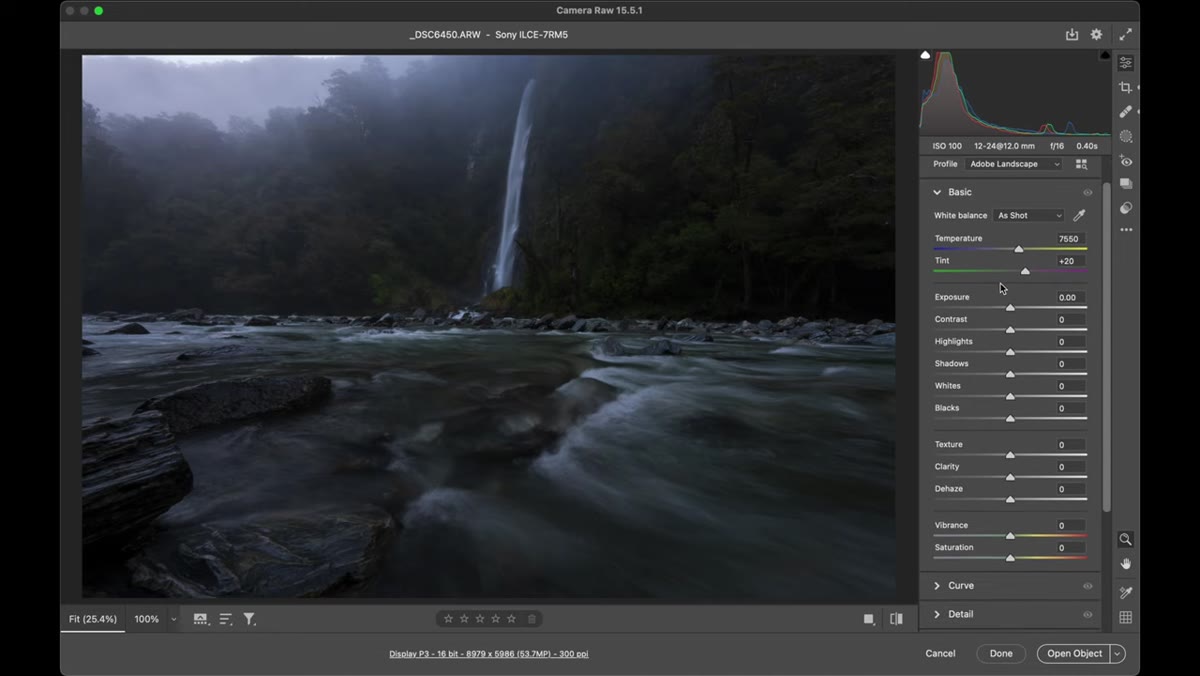 White balance sliders being pulled toward cooler temperature
White balance is not just a technical correction, it is an interpretive choice. For a forest and waterfall scene like the one in this tutorial, Patino pulls the Tint slider slightly to the left to bring out the greens in the water, and then cools the overall Temperature to reinforce the blues already present in the scene. This works because blue and green are adjacent in the color family and naturally complement each other. The strategy is to let the global white balance lean cool, then use targeted adjustments later to introduce warmth selectively in the sky or highlights. That separation is where the image starts to feel dimensional rather than flat.
White balance sliders being pulled toward cooler temperature
White balance is not just a technical correction, it is an interpretive choice. For a forest and waterfall scene like the one in this tutorial, Patino pulls the Tint slider slightly to the left to bring out the greens in the water, and then cools the overall Temperature to reinforce the blues already present in the scene. This works because blue and green are adjacent in the color family and naturally complement each other. The strategy is to let the global white balance lean cool, then use targeted adjustments later to introduce warmth selectively in the sky or highlights. That separation is where the image starts to feel dimensional rather than flat.
Step 4: Handle Vibrance and Saturation With Restraint
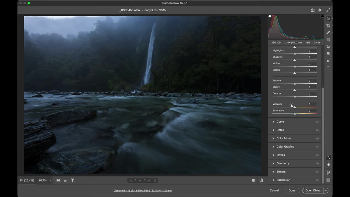 Vibrance slider being increased in the Basic panel
Patino makes a useful distinction here that I have repeated in my own workshops many times. Vibrance affects the midtones. Saturation affects the shadows and highlights. In landscape photography, where you will almost always have deep shadows and blown-out or near-blown highlights, Saturation can overdo things fast. His recommendation is to push Vibrance somewhere between 10 and 30 depending on the scene and treat Saturation much more carefully, often leaving it at zero or nudging it up no more than five to ten points. Start conservative. You can always come back and add more, but pulling back after you have gone too far means other decisions you made along the way may no longer look right.
Vibrance slider being increased in the Basic panel
Patino makes a useful distinction here that I have repeated in my own workshops many times. Vibrance affects the midtones. Saturation affects the shadows and highlights. In landscape photography, where you will almost always have deep shadows and blown-out or near-blown highlights, Saturation can overdo things fast. His recommendation is to push Vibrance somewhere between 10 and 30 depending on the scene and treat Saturation much more carefully, often leaving it at zero or nudging it up no more than five to ten points. Start conservative. You can always come back and add more, but pulling back after you have gone too far means other decisions you made along the way may no longer look right.
Step 5: Bring Exposure Up, Then Guide the Eye With Local Adjustments
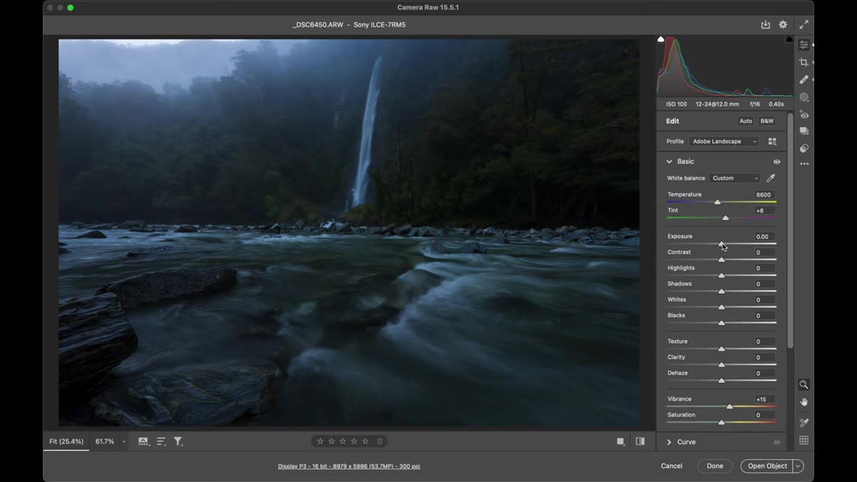 Adjustment brush being painted over the dark foreground area
Once the global color work is done, raise the overall exposure to open up the shadow areas and give the image enough light to work with. Then comes the step that separates good landscape edits from great ones. Using the Adjustment Brush (K on the keyboard in ACR), Patino paints a subtle curve adjustment over the lower right foreground, pulling down the darker midtones. The effect is a gentle vignette that steers the viewer’s eye away from the edges and toward the waterfall. This is local adjustment work, not global, and it is the most powerful tool in the ACR and Lightroom arsenal for controlling where attention goes in a frame.
Adjustment brush being painted over the dark foreground area
Once the global color work is done, raise the overall exposure to open up the shadow areas and give the image enough light to work with. Then comes the step that separates good landscape edits from great ones. Using the Adjustment Brush (K on the keyboard in ACR), Patino paints a subtle curve adjustment over the lower right foreground, pulling down the darker midtones. The effect is a gentle vignette that steers the viewer’s eye away from the edges and toward the waterfall. This is local adjustment work, not global, and it is the most powerful tool in the ACR and Lightroom arsenal for controlling where attention goes in a frame.
Step 6: Use a Second Brush to Add Atmosphere in the Background
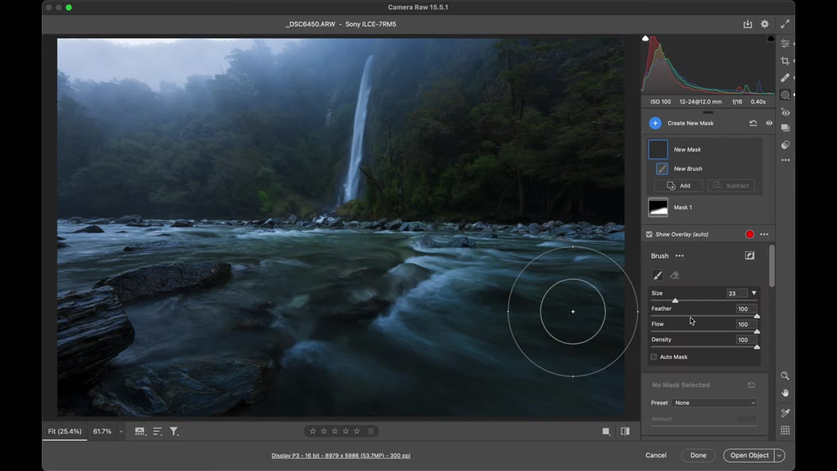 Second adjustment brush applied to background with slight haze reduction
With a second brush, Patino brightens the background area behind the waterfall and then uses the Dehaze slider, but in reverse. Pushing Dehaze into negative territory adds a slight haze effect rather than removing one. In a misty forest or waterfall scene, that atmospheric softness is not a flaw. It is part of the feeling. Adding a touch of it back in the midground and background creates depth and reinforces the sense that you are looking into a layered, living space rather than at a flat image.
Second adjustment brush applied to background with slight haze reduction
With a second brush, Patino brightens the background area behind the waterfall and then uses the Dehaze slider, but in reverse. Pushing Dehaze into negative territory adds a slight haze effect rather than removing one. In a misty forest or waterfall scene, that atmospheric softness is not a flaw. It is part of the feeling. Adding a touch of it back in the midground and background creates depth and reinforces the sense that you are looking into a layered, living space rather than at a flat image.
Step 7: Use Color Grading to Unify the Mood
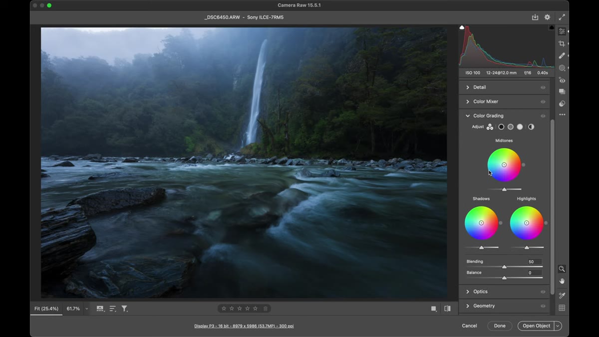 Color grading panel open showing midtones, shadows, and highlights wheels
The Color Grading panel lets you push a specific hue into your shadows, midtones, and highlights independently. For a cool, moody forest scene, you might introduce a slight blue or teal into the shadows and a subtle warm amber into the highlights. This creates a split tone effect that feels cohesive rather than heavy-handed. Patino notes that every image will call for something different here. The point is not to follow a preset formula but to use color grading to reinforce the story you are already telling with your white balance and exposure decisions.
Color grading panel open showing midtones, shadows, and highlights wheels
The Color Grading panel lets you push a specific hue into your shadows, midtones, and highlights independently. For a cool, moody forest scene, you might introduce a slight blue or teal into the shadows and a subtle warm amber into the highlights. This creates a split tone effect that feels cohesive rather than heavy-handed. Patino notes that every image will call for something different here. The point is not to follow a preset formula but to use color grading to reinforce the story you are already telling with your white balance and exposure decisions.
A Note From My Own Experience
One thing I would add from my own practice is to do a before-and-after check at the end of every edit before you export. Hold down the backslash key in Lightroom (or use the preview toggle in ACR) and spend ten full seconds looking at the original file. Not to second-guess your work, but to make sure the edit still reflects what you saw in the field rather than what you thought looked impressive on screen at 11pm. The best edits feel inevitable. They look like the photograph was always supposed to be that way. If the before feels like a completely different scene from a different emotional reality, something in the middle probably got away from you.
The single most important idea in this entire workflow is the sequence. Profile first, white balance second, global tone third, local adjustments fourth. Respecting that order keeps each decision from compounding into something uncontrollable. A flat RAW file is not a failure. It is a starting point.
Watch the full tutorial on YouTube to see Patino walk through each of these steps on an actual file. Watching the sliders move in real time is worth the twenty minutes.
Comments (1)
Bookmarked. Coming back to this one for sure.
Leave a Comment