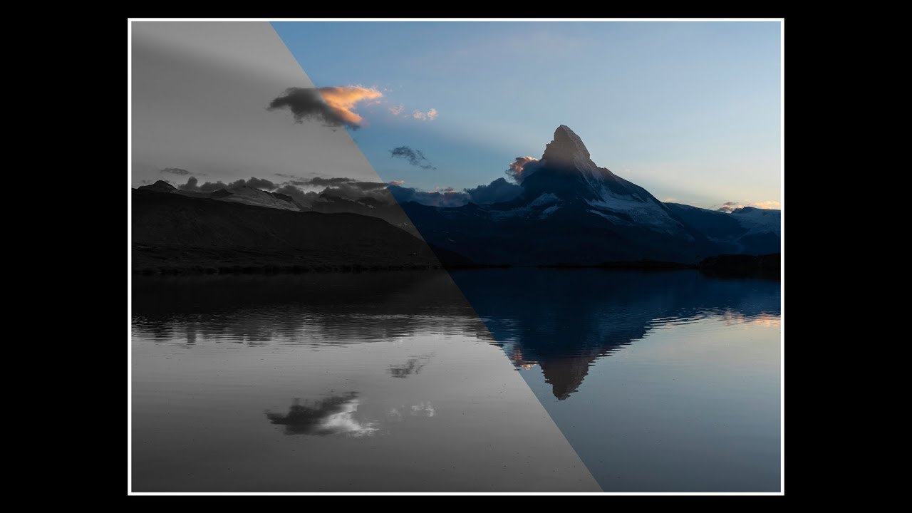
There’s a specific kind of frustration I know well. You’re standing in front of something genuinely magnificent — golden light, saturated color, the whole scene cooperating for once — and you fire off a hundred frames. Back at the desk, you open them in Lightroom, and something feels off. The color is beautiful but it’s also loud. It’s pulling your eye in four directions at once, and the thing you actually wanted to say with the photograph gets buried under all that visual noise. I’ve been chasing that problem for twenty years, and I still don’t always catch it in the field.
That’s why a recent video by Thomas Heaton stopped me cold. Watch the full tutorial on YouTube — it’s built around a single question: when you have gorgeous, saturated, undeniable color in a landscape image, why would you ever choose to convert it to black and white? Heaton uses his own Matterhorn photograph as the case study, walking through his reasoning in a way that’s honest, a little self-critical, and genuinely useful for anyone who’s been treating monochrome conversion as an afterthought.
The tutorial isn’t a step-by-step editing walkthrough in the traditional sense. It’s something more valuable: a photographer thinking out loud about intent. Here’s how I’d break down his process into actionable steps, with some of my own thinking layered in.
Step 1: Evaluate the Composition Before You Touch Color
 Heaton reviewing the Matterhorn sunrise photograph on screen
Before any conversion decision gets made, Heaton starts by critiquing the image on its structural merits alone. He looks at balance, weight, and whether the frame feels stable. In his Matterhorn shot, he identifies a problem in the lower right corner where mist and cloud create a visual void that makes the whole image feel like it wants to tip off-axis. The ridgelines on the left have no counterpart on the right, and nothing fills that negative space.
This is the step most of us skip because the color is so distracting. Train yourself to look at a fresh image and squint. Does the visual weight distribute across the frame, or does it pool in one corner? A composition problem won’t be solved by a black and white conversion, but identifying it early tells you what you’re working with before you start making tonal decisions.
Step 2: Ask What Color Is Actually Contributing
 Color version of the Matterhorn image displayed for comparison
Heaton’s core question is simple and worth repeating: is the color in this image telling the story, or is it competing with the story? In a sunrise or sunset shot, warm light and saturated skies often carry so much visual energy on their own that the actual subject, the mountain, the valley, the specific moment, can get overwhelmed. Color becomes the loudest voice in the room.
Sit with the color version of your image and ask what your eye does first, second, third. If the answer is “it bounces around without settling,” that’s color working against you. If a specific hue is drawing your eye directly to the subject and reinforcing the mood, that’s color working for you. The distinction matters enormously.
Step 3: Consider Mood and What Monochrome Removes from the Equation
 Black and white version of the Matterhorn image revealed
When Heaton reveals his black and white conversion, the shift is immediate. The Matterhorn becomes monumental. The texture in the rock and snow reads more clearly. The sky has weight without color temperature pulling your attention toward warmth or coolness. The image stops being about a beautiful morning and starts being about the mountain itself.
Monochrome strips a scene down to light, shadow, and form. For subjects that are inherently architectural, whether that’s a mountain face, a bare winter tree, or sea stacks at dawn, that reduction can be a revelation. My own rule is loose but useful: if the subject has strong geometric shape or dramatic texture, it’s worth seeing in black and white before you decide.
Step 4: Make the Conversion Decision Intentional, Not Default
 Heaton discussing his personal philosophy on black and white conversion
One thing Heaton is clear about is that converting to black and white should never be a rescue operation. It shouldn’t be what you do when the colors came out muddy or the white balance is off. The decision to convert should come from the same place as every other creative decision: what serves the image?
This is worth internalizing. I see photographers treat monochrome as a stylistic default, something they reach for to give a shot a certain look. That’s backwards. Start with the color version, evaluate it honestly, and then ask whether removing color strengthens or weakens what you’re trying to say. Sometimes the answer is unambiguously yes. Sometimes the color is irreplaceable. The discipline is in asking the question every time.
Step 5: Critique Your Own Work with the Same Honesty You’d Expect from Others
 Heaton pointing out the compositional imbalance in his own image
One of the most useful things Heaton does in this tutorial is openly describe what doesn’t work in his own photograph. He doesn’t qualify it to death or frame it as “some viewers might feel.” He says the image has a balance problem, names where it is, and explains why it bothers him. That kind of self-assessment is a skill, and it’s one worth practicing deliberately.
After every shoot, I go through my selects and write one honest sentence about what’s wrong with each one. Not what I wish were different about the light or the conditions, but what I could have done better. That habit has changed how I edit and how I see in the field. Heaton’s willingness to be direct about his own work is a model worth following.
A Note from My Own Experience: Black and White Forces You to See Structure First
I came to this lesson the slow way. For years I shot almost exclusively in color because I was afraid of stripping the landscape of what made it feel real. What eventually shifted my thinking was shooting film occasionally, where every frame costs something and you can’t afford to be sloppy. Film forced me to look at light and shadow before I looked at color. When I brought that habit back to digital work, I started seeing my images in terms of tonal contrast first. Black and white stopped feeling like a limitation and started feeling like a clarifying tool.
The best thing about Heaton’s tutorial is that it makes this case without being prescriptive. He’s not saying color is wrong. He’s saying that for this image, in this moment, black and white told the truth more clearly. That’s the whole argument, and it’s the right one.
The single most important thing to take from this tutorial: the decision to convert to black and white should come from your subject and your intent, not from habit or rescue instinct. If your image has a strong central subject with shape, texture, or graphic weight, put the color version aside for ten minutes and look at it in monochrome. You might find, as Heaton did with the Matterhorn, that you’ve been letting the light upstage the mountain.
Watch the full tutorial on YouTube and pay close attention to the moment he reveals the black and white version. Even if you disagree with the choice, the reasoning will make you a more deliberate photographer.
Comments (2)
Would love to see a follow-up going deeper into this topic.
Love this. I referenced a similar technique in one of my recent posts. Always good to see other perspectives.
Leave a Comment